
Generating a design for a design generator • Designing Recraft, Part I
Behind the scenes of the design process for Recraft

In late 2022, I took the lead in Product and Design, beginning a challenging yet fulfilling journey to develop an app for designers. I'm excited to give you a peek into how we do things, and I hope you find it engaging and useful.
Recraft is an image generator for consistent style graphics: true vector illustrations, icons, 3D and other types of images.
Our main challenge was to understand what the interface would look like. A chat with an AI? A supercharged version of Figma? A canvas with a minimalistic UI? At the time, other AI generators were mainly made by developers for developers. They were too complicated for the average person to use. They asked to write a “prompt”, set a seed and choose a sampling method. Or they wanted you to be a coder, typing code-like messages using complex prompts like 'trending on artstation | 19:9, great anatomy' and so on.
Therefore, we intended to design our product to stand out with its user-friendly and straightforward interface, avoiding the usual complexity of programming.

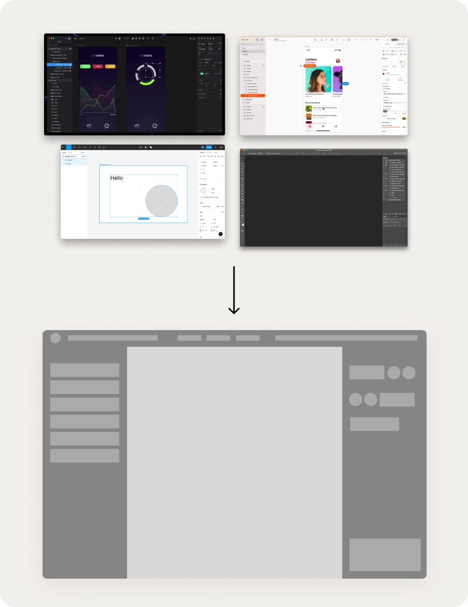
Typically, the first thing that comes to mind when you think of a design app UI is this layout compressing the workspace from all sides:
Our aim is to move beyond existing apps and start fresh. To envision what this new interface could look like, I started by rapidly prototyping a range of ideas. I played around with different concepts to check how user-friendly they are for daily use and to get a feel for how tricky they might be to build, especially of development and machine learning.
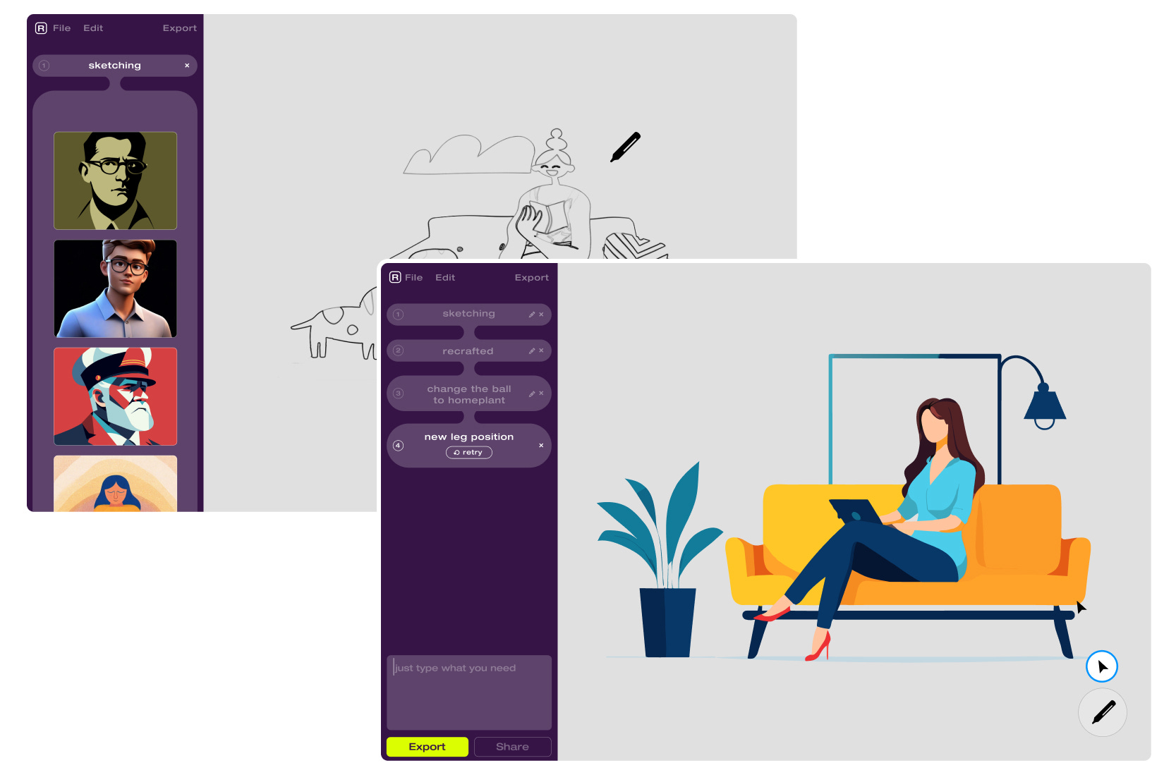
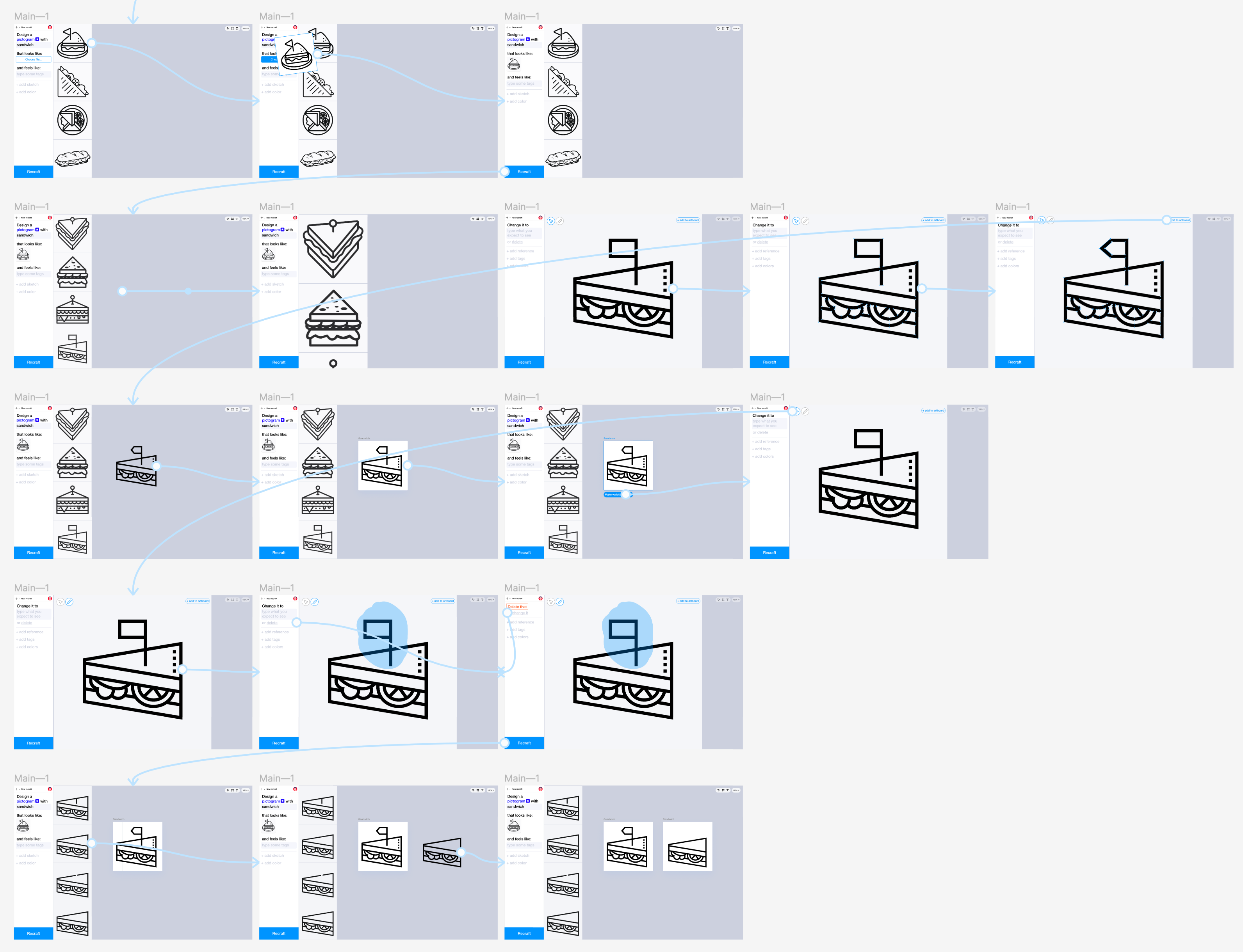
My initial thought was to design a dialogue-based interface with no controls at all. The idea was to describe images and give instructions through text. For example, “generate a sofa”, “place a cat next to it”, “change its color to blue”, and so on.

And to visualize the history of changes like a timeline, so you can see how the image evolves:
At this point, visuals weren't a big deal. I could've gone with basic wireframes, but I like to mix it up – keep it messy and raw.
You see, grey mockups? They don't really grab you, emotion-wise. But flip the script, and you start building a visual language. When I look at these designs, it's easy to say 'nah, definitely not this.' And that's the thing — feeling something, anything, is a way better than no reaction at all.
There was also an idea to transform the interface into a ‘history tree’ of changes, with an option to go back to previous generation results:

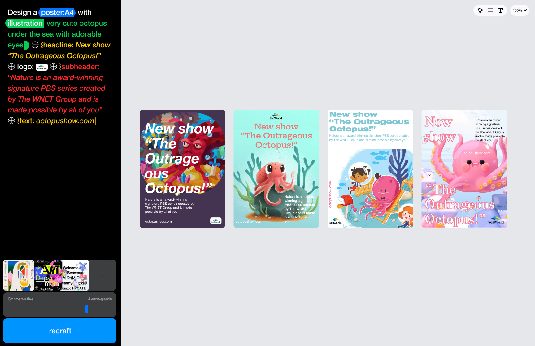
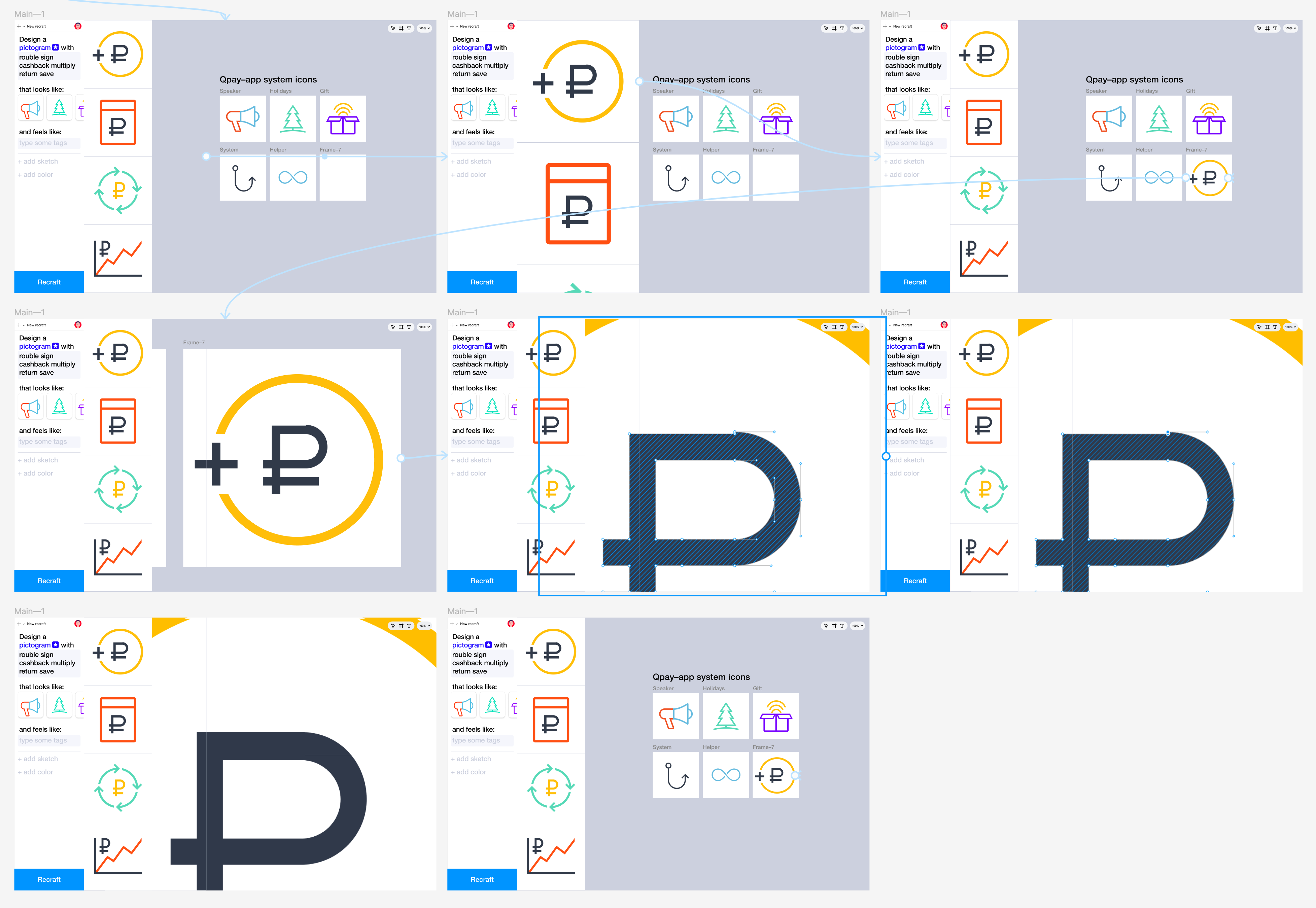
Then, I considered how to make prompt creation more intuitive. For instance, assembling the prompt from blocks, where you gradually build the image from elements:

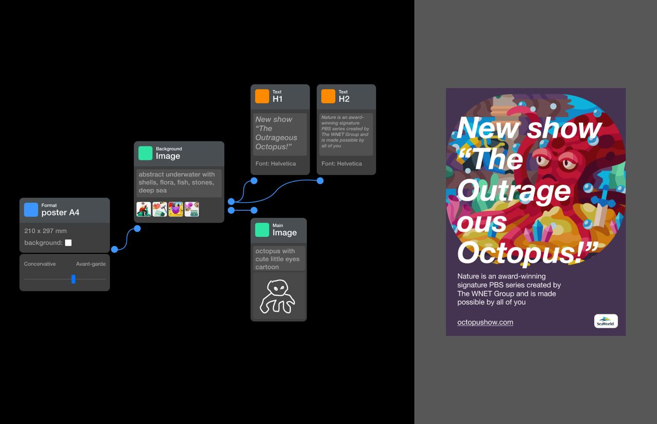
I even tried the wild idea of a node-based interface, where you could design layouts with illustrations:
There was an approach to input requests using a syntax-based system, kind of like a mix of design and engineering:
And of course, I experimented with an interface similar to Figma or Sketch, complete with a sidebar.

During this time, we were defining who would the users of Recraft be. After digging into some research and stats, we decided to initially focus on three groups: product designers who need to quickly generate graphics, illustrators who could use a quick sketch to get the desired image, and brand designers who need to generate frequent images. We also kept in mind that our users might not just be designers, but also managers or marketers.
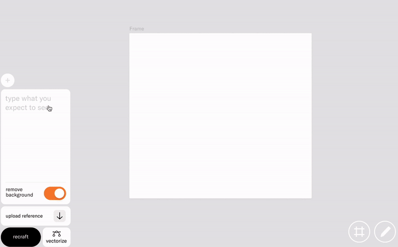
We settled on a few key ideas: the prompt would consist of a short textual description and visual controls. Plus, there would be a feed showing your past results, and at the heart of it all, a canvas where you can arrange space however you like.

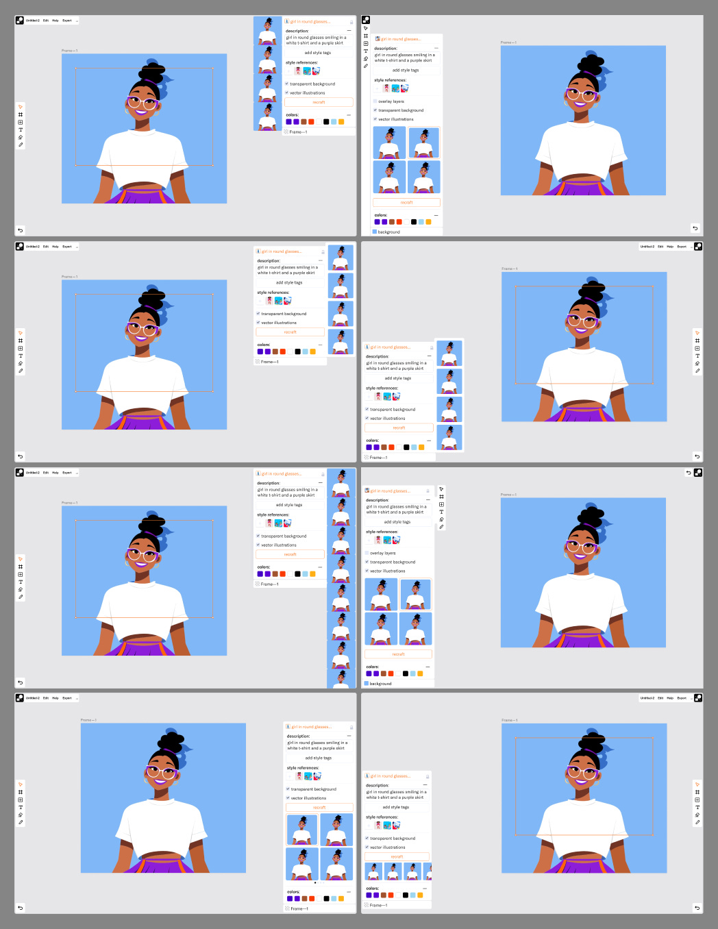
I made prototypes to enable clicking through key scenarios: generation, uploading style references, editing vectors.
We let the concepts simmer for a while and then realized that the panels were taking up a lot of useful space. Sketching in a small window was inconvenient, and the history feed was too prominent. So, I started focusing more on the canvas and building the interface around it.

Exploring how to arrange the layer panel, history, toolbar, menu, and other elements:
As we progressed, we noticed that our goal of a simple interface was beginning to slip away. We also realized that there would not be too many layers, so we dialed back on emphasizing the list of elements. We ended up removing all the non-essential parts and, instead of having them scattered around the screen, we arranged them in a tighter, more organized way:
We tested it across range of scenarios:
Finally, we went ahead with this design and started working on the front-end, back-end, and vectorization, then kicked off the MVP for user testing.
To be continued…

I am Ivan Olenkevich — designer with 15 years of experience across different functional roles. I am leading design and creative teams for the last 6 years, building products, brands, and digital experiences.